Is Mobile First A Bad Idea?

PlanFlow Team
Published: 2023-03-23
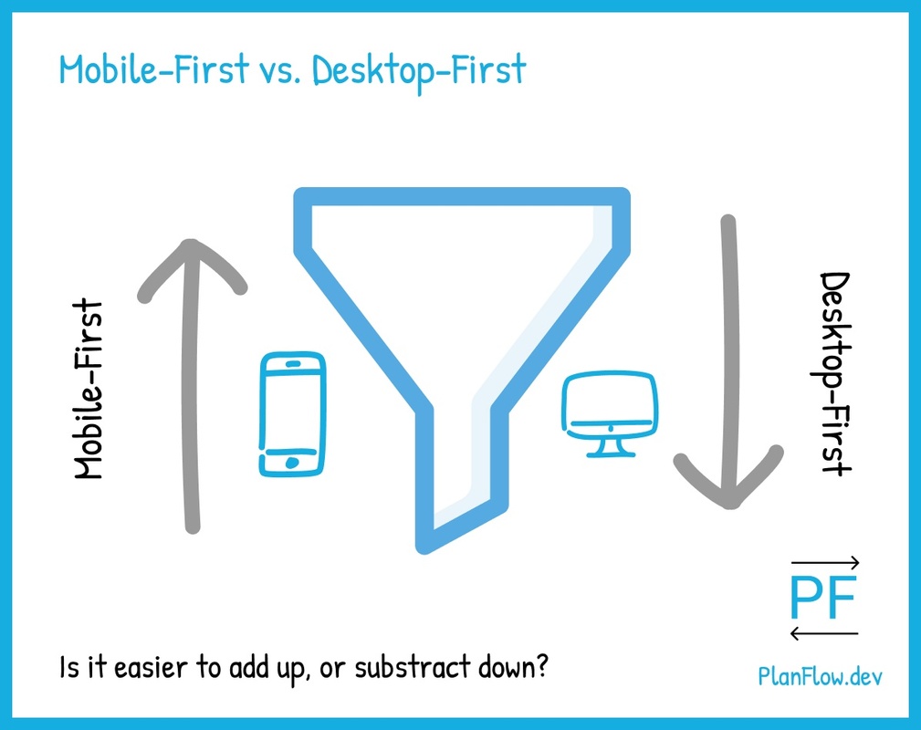
Desktop-First Vs Mobile-FirstMobile-First Vs Desktop-FirstWhy Desktop-FirstWhy Mobile-FirstWhile I understand the idea behind the mobile first approach to developing websites, it has always felt a bit off to me.
Mobile first, which is a design approach that involves starting with the mobile version of a website before the desktop version, is a great idea in theory.
The problem comes when it meets reality.
There are countless stories of developers who, upon hearing about (and even learning how to design with) a mobile first approach, ultimately ended up reverting back to, and starting with, the desktop versions of their sites.
According to a survey conducted by Kevin Powell (a GREAT frontend tutorial maker), the majority (61.5%) of developers prefer to start with the desktop first:

This is a sentiment that I have also found to be true on many message boards and online discussions that I’ve seen around responsive web design.
It is interesting that despite the evidence that the majority of developers simply do not really want to design websites with a mobile first approach, the idea is still being championed as the preferred methodology.
Let’s explore why this is.
Why mobile first is often championed
There are three main reasons why the mobile first approach is often touted as the best approach to take for developing a responsive website:
1. The increasing shift towards mobile (the best argument, which I in fact agree with)
This is the strongest of all the reasons why you would want to prioritize mobile first within your design process, and it is the one that I would most agree with. In the cases where the vast majority of your users are on mobile devices, then priority in both design and development should of course be given to the mobile use case – for example, with sites such as Instagram, where mobile is almost all of the usage.
In this case, and in other cases where the vast majority (80%+) of usage is on a device other than the desktop, then the major arguments made in this article don’t apply as much.
The remaining points in this article will assume that traffic on a website by device type is more evenly split, and that there are a reasonable number of users at different screen sizes.
2. Better UX at every screen size
The second point is that mobile first provides a better user experience at every screen size, because it best optimizes for the smaller screen sizes as well as the larger ones. The argument is that it does this by focusing on only the most important elements of the layout, as that is all that can fit on the smaller mobile screens. And that this focused approach scales up well.
The trouble with this is that it simply does not seem to hold up under scrutiny.
What actually seems to happen with mobile first is that the site just becomes less creative overall.
Most mobile sites (and their subsequent desktop sites) end up looking pretty much the same as every other website out there.
We’ll see why this is the case shortly (the diagram at the top of this post will give you an idea).
3. Better organized (and easier to create) CSS
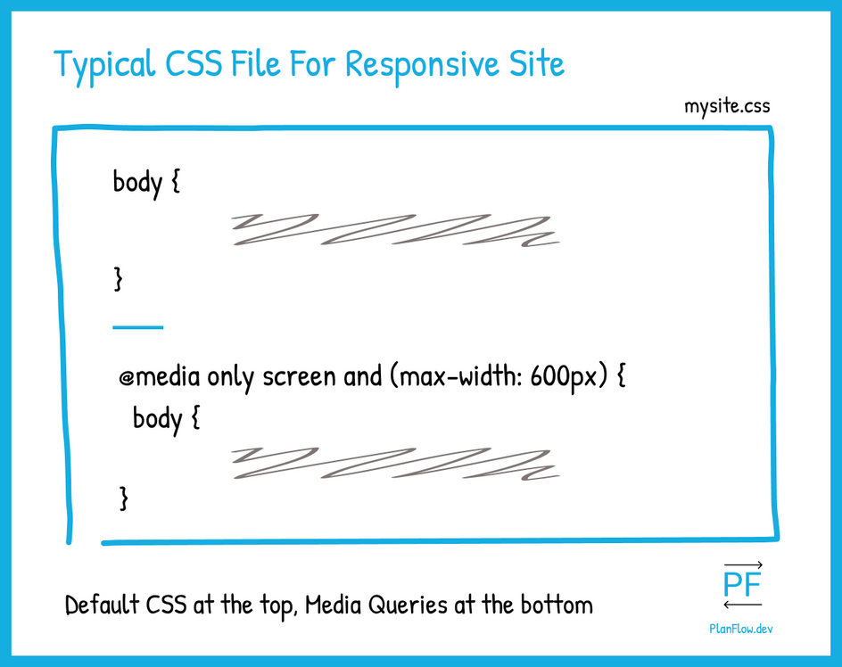
The third reason why mobile first is often regarded as the best way to develop a responsive website is that on most sites, the “default” CSS styles (i.e. the styles that are written outside the scope of media queries) are often the ones that are aimed at the smaller, mobile screen sizes.
Typical CSS file organization for a responsive website:

Because the typical workflow of a responsive website is to add the media query-related styles after the fact (because media queries are supposed to be at the bottom of the page, as mentioned above), starting with what would be your default styles – which would be your mobile styles – seems to make more sense.
We will see shortly why this is not exactly correct either.
Let’s dive into the key reasons why, despite these three decent arguments in favor of a mobile first approach to responsive web design, it still is not the best way to approach it.
Why mobile first is good in theory but bad in practice
You are optimizing for the sub-optimal experience
The mobile experience is sub-optimal. This assertion is not really debatable. The entire point of a mobile version of a site is to deliver a lesser but still somewhat effective version of the optimal desktop experience.
The problem with optimizing for the mobile experience is that it does not make the overall experience optimal. It only scales up sub-optimality. The compromises that start on the mobile experience ultimately become compromises on the desktop end.
It only degrades the desktop experience.
The desktop site is the “real” site in most cases; most clients expect to see a desktop site first.
Desktop first focuses on the design problem that people actually care about, while mobile first focuses on the CSS organization problem, which only developers do.
Instead of starting with the sub-optimal experience (that helps the developer), it’s much better overall to optimize for the best, full-scale experience (that helps the user) and then scale down.
It’s an unnatural way to design
Because design is fundamentally an intuitive process, any design approach that requires you to have to “get over yourself” is probably a bad idea.
Design is basically a process of guiding the user by developing an interface based on what guides you, naturally.
For this to be effective, context is key; and being able to maximally utilize the scope of experience of the user gives you more “surface area” with which to appropriately provide the context and guide them.
For this reason, It’s better to start at the largest possible context for this.
Take, for example, a professional sports match. Which has a better chance of delivering the fullest, most complete experience to you?
The actual “bigger,” more natural, live game?

Or the TV experience?

What should be optimized for first to deliver the best final result in both cases?
The desktop experience encompasses what is essential information within a mobile context. Mobile does not necessarily have what is essential to a desktop context.
This is why desktop-first seems to feel more natural to most developers. It’s just enough constraint for the task of navigating a website, but not too much.
This leaves an ideal amount of room for creativity – which mobile first destroys.
Mobile first destroys creativity
With mobile first, there are too many unanswered questions.
Questions that should have been answered at the desktop level ultimately never get answered.
At the desktop level, the challenges are often much bigger and require more creativity to solve. This is because the questions you need to ask for smaller screens are simply fractals (or subsets) of their larger counterparts. It’s much better to answer them first at the larger sizes, which then makes it easier to answer subsequent smaller size and mobile design questions.
With a mobile first approach, you can fall into the trap of getting so fixated on the subsets that you fail in giving people the essence of the page. This essence is what the initial answers to the bigger design questions give you.
To get that essence, you have to proceed in the same way that you would if you were making wine: you have to crush grapes at scale, and then gradually go through a distillation process to finally produce a wine. In the same way, to get a mobile version that really gets to the core of a site, it’s best to start with the desktop version and then gradually filter or scale down.
Mobile first makes design too formulaic
Because of the degree of constraint in the mobile-first approach, and the lack of room for creativity that this engenders, developers naturally seek out tried and true patterns that they can follow.
This isn’t a bad thing, as we all use inspiration to a degree. The issue is that, just as we’ve seen with frameworks like Bootstrap, too much of a formulaic approach often leads to a level of sameness that literally bores everyone.
Mobile first may be one the things contributing to the ever-increasing “sameness” of the Web that we see nowadays.
This consequently reduces the kind of web activity that we want (such as conversions) across the board. People are simply less engaged and are tuning these websites out.
Imagine if those quirky and endlessly interesting sites of the late 90s and early 2000s, like the ones we used to find on GeoCities and Angelfire, were thinking about mobile first!
Do you think they would have achieved the same level of uniqueness? I doubt it.
An alternative (desktop first) approach
The mental shift that we should make is not desktop first to mobile first.
It’s not to simply squish things on the desktop either.
The correct mental shift is to ask, once we have a desktop version, what do we need to resize, rearrange, or remove in order to have an optimal yet still equally informative experience on mobile?
We should be asking how we can make the mobile experience a good fractal of the desktop experience.
We should ask what we are trying to achieve with our desktop site, and how we can achieve (even if only a little bit) the same thing on smaller screens.
The way that we should design our websites should be to start with the desktop first, and then scale down with empathy, asking the big designs questions before we start to ask the smaller ones.
We should start our web design process at the bottom of the CSS file, with the desktop-sized media query, instead of making those first global (mobile first) styles.
After that, once we have answered our biggest design questions at the desktop level, we can scale down (and up in the code) with more media queries (in the case of the smaller sizes) and with the default global styles in the case of the absolute smallest mobile size, taking out all but the essentials.
Ultimately, this feels like the most natural approach to take.
--
Check out the easiest way to plan your website or mobile app. Try PlanFlow for free.