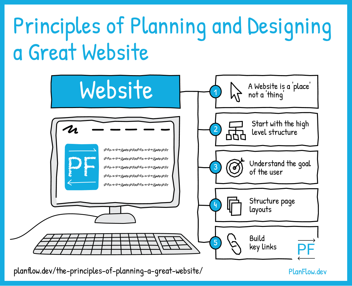
The 5 Principles of Planning and Designing a Great Website

PlanFlow Team
Published: 2022-10-11
Information Architectureplanning a websitesitemapUX PlanningInformation Architecture is the essence of the Web, and essence of what makes a great website great.
The structure of a set of information is what draws people to it.
It’s no accident that directories were the first websites to get really popular in the early days of the Web.
Yahoo’s original name was “Jerry and David’s Guide to the World Wide Web,” consisting of a directory of other websites.
So what am I getting at here? Why does it matter that the most popular type of websites in the early days of the Web were directories? And what does this have to do with your website?
The answer is Information Architecture.
The main reason these websites are popular is because of the WAY that they are structuring information for you, the way they structure information – as the Yahoo co-founders originally termed it – to guide you. You can use the principles they use for your website. And WIN.
Let’s dig into these principles one by one so that we can use them to build our sites to a high level:
Principle 1: A website is a “place,” not a “thing.”
As Alan Kay once remarked, “A change of perspective is worth 80 IQ points.” What often makes us get websites wrong is a misunderstanding of what they actually are.
A thing, you use. A place, you inhabit and are “guided” within it.
Principle 2: Start with the overall structure.
This means starting with the big picture (goals, top-level menu links) in your site structure, then gradually getting down to the details (individual page layouts and elements). This is what @PlanFlowDev helps you do.
Principle 3: Understand the goal of the user
If you view the overall structure of your website’s information hierarchy like a pyramid, the goal is the pinnacle. This is key to the overall structure; you move from what the key links of the site will be to how pages will be structured.
The goal is ultimately where you want the user to be guided to within your website.
This main goal – such as buying a product – can be subdivided into subgoals that get the user to that point, such as viewing the selection of products, navigating to the product page, reading reviews and clicking on the buy button.
As you can see, these subgoals are supported by pages, sections of a page and components within the website pages (such as nav links).
All of the components that build up to that goal, such as the site links, navigation, pages and page elements together create the subgoals. Together these create the context for the overall goal (buying a product) to be fulfilled.
Principle 4: Build key links based on the goal (hierarchically)
The initial links on your site (ie. the “main menu/nav” items) come first, and should be all about getting the user closer to their goal in the user journey. For example, if the user’s goal is to create an account , my “main menu” would be like this:
Home – Create an Account – Login – Contact Us
These are the key links that help the user achieve their goal:
“Home page” – for general info
“Create an Account” – for the action, after that info has been received.
“Login” – once an account exists
“Contact Us” – if there are any problems.
Notice the hierarchy – in this case, from left to right.
Now that we have the links and the general idea, we can go to the final principle:
Principle 5: Structure page layouts based on goal and hierarchy
Most page layouts on the Web are approached as graphic design pieces, rather than as visual guides.
Remember that the sitemap is not necessarily the territory. Although helpful as an overall structure, it is only by understanding and fleshing it out based on user goals that it gains accuracy and usefulness.
The ideas in the principles described above – keeping the goal and the hierarchy of elements that navigate towards it in mind – is how layouts and sitemaps should be designed.
Despite the fact that many web designers don’t know this, most sites do get the general ideas behind this approach right. If you want to prove this to yourself, take a look at some sites.
What is the first set of elements you see?
The “main menu.”
What these principles will do is help you to actually know what you’re doing. And as result, ultimately make your website that much better.
--
Check out the easiest way to plan your website or mobile app. Try PlanFlow for free.